(Transitions & Transforms 07) 3D transform
in CSS
SoloLearn CSS 번역
CSS 3D transforms
3d transform
- Along with the x and y axes, 3D Transforms introduce the
Z-axis, which enable 3D manipulations.- 3D transform은 x축 및 y축과 함께 3D 조작을 가능하게 하는
Z-axis를 도입한다.
- 3D transform은 x축 및 y축과 함께 3D 조작을 가능하게 하는
- 3D Transforms are quite similar to 2D Transforms:
- 3D transform은 2D transform과 매우 유사하다.
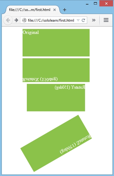
- rotateX(), rotateY() and rotateZ() rotate an element in 3D space around the corresponding axis at a given degree.
- rotateX(), rotateY(), rotateZ()는 지정된 각도에서 해당 축을 중심으로 3D 공간의 element를 회전시킨다.
- CSS:
div.X {
   transform: rotateX(150deg);
}

div.Y {
   transform: rotateY(150deg);
}

div.Z {
   transform: rotateZ(150deg);
}
- Result:
You can switch off all transformations applied to an element using the none function:
transform: none;none 함수를 사용해서 element에 적용된 모든 변환을 끌 수 있다:
transform: none;
translate Method
translate 메소드
- 3D translate methods allow you to move the element
horizontally(translateX),vertically(translateY) andinto or out of the screen(translateZ), using any CSS length units (px, em, %, etc).- 3D translate 메소드를 사용하면, CSS length 단위(px, em, % 등)를 사용해서 element를
가로 방향(translateX),세로 방향(translateY),화면 안쪽 또는 바깥쪽(translateZ)으로 이동시킬 수 있다.
- 3D translate 메소드를 사용하면, CSS length 단위(px, em, % 등)를 사용해서 element를
- Positive values moves the element toward the viewer, negative values away.
- 양수 값은 element를 viewer 쪽으로 이동시키고, 음수 값은 멀리 이동시킨다.
- CSS:
#mybox1 {
   transform: translateX(29px)
      translateY(5em)
      translateZ(-13px);
}
- Result (Before translation):
- Result (After translation):
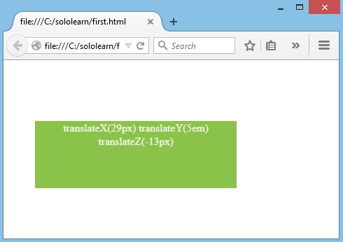
- The
translate3d()method allows us to pass the x, y, and z offsets, all at once and in the following order.translate3d()메소드를 사용하면 x, y, z offset을 한 번에 다음 순서로 전달할 수 있다.
#mybox1 {
   transform: translate3d(-20px, 4em, 10px);
}
- Like the translate3d() method, there are also
scale3d()androtate3d(), which are applicable for scaling and rotating elements in 3D.- translate3d() 메소드와 마찬가지로,
scale3d()와rotate3d()도 3D에서 element scaling과 회전에 적용할 수 있다.
- translate3d() 메소드와 마찬가지로,
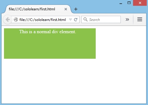
Translation of an element is similar to relative positioning - it doesn’t affect the document’s flow.
element의 변환은 상대적 위치 지정과 유사하다.
The translated element will keep its position in the flow and will only appear to have moved.
변환된 element는 flow에서 위치를 유지하며 이동한 것처럼 보인다.
perspective Property
perspective(원근법) 속성
- Perspective defines how the depth of the 3D scene is rendered.
- perspective는 3D 장면의 깊이가 렌더링 되는 방법을 정의한다.
- Think of perspective as a distance from the viewer to the object.
- viewer에서 대상까지의 거리라고 생각해보자.
- The greater the value, the further the distance, so the less intense the visual effect.
- 값이 클수록 거리가 멀어지므로, 시각 효과가 덜 강해진다.
- When defining the perspective property for an element, it is the
childelements that get the perspective view,notthe element itself.- element에 대한 perspective 속성을 정의할 때, 원근법 view를 가져오는 것은 element 자체가
아닌,childelement이다.
- element에 대한 perspective 속성을 정의할 때, 원근법 view를 가져오는 것은 element 자체가
- CSS:
div.empty-div {
   perspective: 100px;
}

div.green-div {
   transform: rotateX(45deg);
}
- Result:
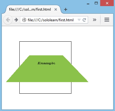
The perspective property only affects 3D transformed elements.
perspective 속성은 3D로 변형된 element에만 영향을 준다.
QUIZ
- Add a rotate function that rotates the element 45 degrees around the Z axis.
- element를 Z축 주위로 45도 회전시키는 rotate 함수를 추가해라.
transform: rotateZ(45deg);
- Fill in the missing value to “push” the elements 100 pixels back.
- 100 픽셀 뒤로 element를 “push” 해라.
transform: translateZ(-100px);
- Higher perspective value means:
- 높은 perspective 값은 다음을 의미한다.
further distance