(Transitions & Transforms 05) keyframes & animation
in CSS
SoloLearn CSS 번역
CSS Keyframes & Animation
- An animation lets an element gradually change from one style to another.
- 애니메이션을 사용하면 element가 한 style에서 다른 style로 점차 변경된다.
- You can change as many CSS Properties as you want to, as many times you want to.
- 원하는 만큼 많은 CSS 속성을 변경할 수 있다.
Keyframes: hold the styles the element will have at certain times- element가 특정 시간에 가질 style을 유지한다.
The @keyframes Rule
@keyframes 규칙
- When you specify CSS styles inside the @keyframes rule, the animation will gradually change from the current style to the new style at certain times.
- @keyframes 규칙 내에서 CSS style을 지정하면, 애니메이션이 현재 style에서 새로운 style로 점차 변경된다.
- To get an animation to work, you must bind the animation to an element.
- 애니메이션이 작동하도록 하려면, 애니메이션에 element를 bind 해야 한다.
- The following example will change the background color of an element three times: when the animation is 50% complete, 70% complete, and when the animation is 100% complete.
- 다음 예제는 애니메이션의 50%, 70%, 100% 완료 때의 element 배경색을 세 번 변경한다.
- CSS:
@keyframes example {
   0% {
      background-color: red;
   }

   50% {
      background-color: yellow;
   }

   70% {
      background-color: blue;
   }

   100% {
      background-color: green;
   }
}
exampleis the name of the animation.
example은 애니메이션의 이름이다.
You can choose any name for your animation.
애니메이션의 이름을 선택할 수 있다.
- As an alternative to using percentages, you can use
fromandtokeywords, where:- 백분율을 사용하는 대신,
from과to키워드를 사용할 수 있다.
- 백분율을 사용하는 대신,
fromis a starting offset of0%from은0%의 시작 offset이다.
tois an ending offset of100%to는100%의 종료 offset이다.
- The two examples below are equivalent, and produce the same result:
- 아래 두 예제는 동일하며, 동일한 결과를 생성한다.
@keyframes colorchange {
   0% {
      background-color: red;
   }

   100% {
      background-color: green;
   }
}
@keyframes colorchange {
   from {
      background-color: red;
   }

   to {
      background-color: green;
   }
}
- To get an animation to work, you must bind the animation to an element.
- 애니메이션이 작동하도록 하려면, 애니메이션을 element에 bind 해야 한다.
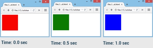
- In the example below, the animation lasts one second, and changes the background color of the red div to green and blue.
- 아래 예제에서 애니메이션은 1초 동안 지속되고, 빨간색 div의 배경색이 초록색과 파란색으로 변경된다.
div {
   width: 100px;
   height: 100px;
   background-color: red;
   animation-name: colorchange;
   animation-duration: 1s;
}

@keyframes colorchange {
   0% {
      background-color: red;
   }

   50% {
      background-color: green;
   }

   100% {
      background-color: blue;
   }
}
- Result:
- The
animation-nameproperty specifies the animation to be used for the element.animation-name속성은 element에 사용할 애니메이션을 지정한다.
- The
animation-durationproperty specifies the duration of the selected animation.animation-duration속성은 선택된 애니메이션의 지속 시간을 지정한다.
If the animation-duration property is not specified, the animation will have no effect, because the default value is 0.
animation-duration 속성을 지정하지 않으면 기본값이 0이므로, 애니메이션이 적용되지 않는다.
QUIZ
- Can you have multiple keyframes in an animation property?
- 애니메이션 속성에 여러 개의 keyframe을 가질 수 있는가?
Yes
- Which alternative word can be used in place of 0%?
- 어떤 대체 단어가 0% 대신 사용될 수 있는가?
from
- Fill in the blank to define an animation named “anim” containing keyframes.
- keyframes을 포함하는 “anim”이라는 애니메이션을 정의해라.
@keyframes anim