(Transitions & Transforms 03) transform origin, translate(), skew() 메소드
in CSS
SoloLearn CSS 번역
CSS transform origin, translate(), skew()
transform-origin Property
transform-origin 속성
- The
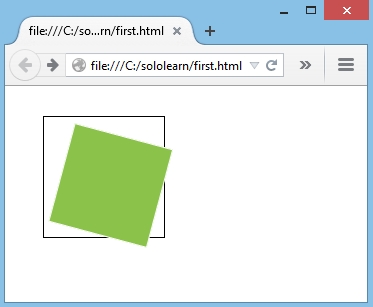
transform-originproperty allows you to change the position of transformed elements.transform-origin속성을 사용하면 변형된 element의 위치를 변경할 수 있다.
- The default value for the property is 50% 50%, which corresponds to the center of the element.
- 속성의 기본값은 element의 center에 해당하는 50% 50%이다.
- In the example below, we use the
transform-originproperty together withtransform-rotate.- 아래 예제에서는
transform-origin속성을transform-rotate속성과 함께 사용한다.
- 아래 예제에서는
- The origin of the x-axis (horizontal) is set to 25% from the left.
- x축(가로)의 원점은 왼쪽에서 25%로 설정된다.
- The origin for the y-axis (vertical) is set to 75% from above.
- y축(세로)의 원점은 위에서 75%로 설정된다.
- CSS:
div.empty-div {
   position: relative;
   height: 100px;
   width: 100px;
   margin: 30px;
   padding: 10px;
   border: 1px solid black;
}

div.green-div {
   padding: 50px;
   position: absolute;
   background-color: #8bc34a;
   border: 1px solid white;
   transform: rotate(15deg);
   transform-origin: 25% 75%;
}
- Result:
0 0is the same value astop left, and100% 100%is the same value asbottom right.
0 0은top left와 같은 값이고,100% 100%는bottom right와 같은 값이다.
The transform-origin property must be used together with the transform property.
transform-origin 속성은 transform 속성과 함께 사용해야 한다.
The translate() Method
translate() 메소드
- The
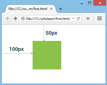
translate()method moves an element from its current position (according to the parameters given for the x-axis and the y-axis).translate()메소드는 element를 현재 위치에서 x축과 y축에 대해 지정된 매개변수에 따라 이동시킨다.
- Positive values will push an element down and to the right of its default position, while negative values will pull an element up and to the left of its default position.
- 양수 값은 element를 기본 위치의 오른쪽으로 내린다.
- 음수 값은 element를 기본 위치의 왼쪽 위로 끌어올린다.
- In this example below, the div element is moved
100px to the rightand50px down:- 아래 예제에서 div element는
오른쪽으로 100 픽셀과아래쪽으로 50 픽셀이동시킨다.
- 아래 예제에서 div element는
div {
   padding: 50px;
   position: absolute;
   background-color: #32CD32;
   transform: translate(100px, 50px);
}
- Result:
An element can also be moved by setting the margins or by positioning the element, although translate is a better choice for animating elements.
margin을 설정하거나 element를 배치해서 element를 이동시킬 수도 있지만, translate는 element를 애니메이션 하는 데 더 나은 선택이다.
The skew() Method
skew() 메소드
- The
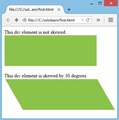
skew()method skews an element along the x-axis and the y-axis by the given angles.skew()메소드는 지정된 각도만큼 x축과 y축을 따라 element를 기울인다.
- The following example skews the <div> element by 30 degree along the X-axis:
- 다음 예제는 <div> element를 X축에 따라 30도 기울인다.
transform: skew(30deg);
- Result:
If the second parameter is not specified, it has a zero value.
두 번째 매개변수가 지정되지 않은 경우, 값은 0이다.
QUIZ
- Which choice is the default value for the transform-origin property?
- transform-origin 속성의 기본값은 무엇인가?
center
- Add a translate function that moves the element 50 pixels from the left and 100 pixels from the top.
- element를 왼쪽에서 50 픽셀, 위에서 100 픽셀 이동하는 translate 함수를 추가해라.
transform: translate(50px, 100px);
- Which value type is used in the skew function?
- skew 함수에 어떤 type의 값이 사용되는가?
degrees