(Transitions & Transforms 02) transform: rotate()
in CSS
SoloLearn CSS 번역
CSS transform: rotate()
CSS3 transform Property
transform 속성
- CSS3 transforms allow you to translate, rotate, scale, and skew elements.
- CSS3 transform을 사용하면 element를 translate, rotate, scale, skew 할 수 있다.
- A transformation is an effect that lets an element change shape, size, and position.
- transform은 element의 shape, size, position을 변경하는 효과이다.
- CSS3 supports 2D and 3D transformations.
- CSS3는 2D와 3D 변형을 지원한다.
div {
   width: 200px;
   height: 100px;
   margin-top: 30px;
   background-color: #32CD32;
}
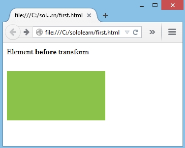
- The div element before the transform will look like this:
- transform 전의 div element는 다음과 같다.
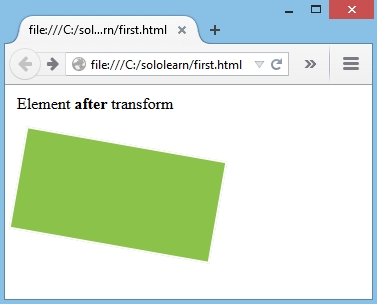
- Now let’s apply the div element to rotate by
10deg:- 이제
10deg회전을 div element에 적용해보자.
- 이제
div {
   width: 200px;
   height: 100px;
   margin-top: 30px;
   background-color: #32CD32;
   transform: rotate(10deg);
}
- Result:
- The rotate() method rotates an element clockwise or counter-clockwise, according to a given degree.
- rotate() 메소드는 주어진 각도에 따라 element를 시계 방향 또는 반 시계 방향으로 회전시킨다.
Negative valuewill result in a counter clockwise rotation.
음수 값을 지정하면 시계 반대 방향으로 회전한다.
Using Negative Values
음수 값 사용하기
- As previously mentioned, using a positive value will rotate an element
clockwise, and using a negative value will rotate the elementcounter-clockwise.- 앞에서 언급했듯이, 양수 값을 사용하면 element가
시계 방향으로 회전하고, 음수 값을 사용하면 element가시계 반대 방향으로 회전한다.
- 앞에서 언급했듯이, 양수 값을 사용하면 element가
div.positive {
   width: 200px;
   height: 100px;
   margin-top: 30px;
   background-color: #32CD32;
   transform: rotate(10deg);
}

div.negative {
   width: 200px;
   height: 100px;
   margin-top: 30px;
   background-color: #32CD32;
   transform: rotate(-10deg);
}
- Result:
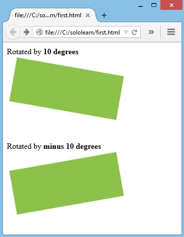
QUIZ
- What value does the rotate function take?
- rotate 기능에는 어떤 값이 있는가?
angle
- Add the transformation property to rotate the element 45 degrees, counter-clockwise.
- element를 시계 반대 방향으로 45도 회전시키는 속성을 추가해라.
transform: rotate(-45deg);