(Transitions & Transforms 01) transition 속성
in CSS
SoloLearn CSS 번역
CSS3 Transition Property
transition 속성
- CSS3 transitions allow us to change from one property value to another over a given duration.
- CSS3 transition을 사용하면 주어진 기간 동안 하나의 속성 값을 다른 속성 값으로 변경할 수 있다.
transition-property: specifies the property to be transitioned- 변환할 속성을 지정한다.
transition-duration: specifies the duration over which transitions should occur- 전환이 발생해야 하는 기간을 지정한다.
transition-timing-function: specifies how the pace of the transition changes over its duration- 전환 속도가 해당 기간 동안 어떻게 변하는지 지정한다.
transition-delay: specifies a delay (in seconds) for the transition effect- 전환 효과에 대해 delay(초)를 지정한다.
- In the example below, we set the transition property to
transform, with adurationof 5 seconds, and with anease-intiming function that specifies a transition effect with a slow start.- 아래 예제에서는 transition 속성을 설정한다.
transform으로, 5초의duration, 느린 시작으로 transition 효과를 지정하는ease-intiming 기능을 설정한다.
transition: transform 5s ease-in;
Transition effects can be applied to a wide variety of CSS properties, including
background-color,width,height,opacity, and many more.transition 효과는
background-color,width,height,opacity등을 포함한 다양한 CSS 속성에 적용할 수 있다.
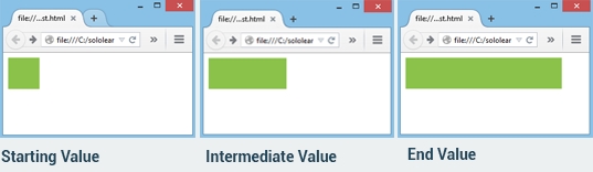
- In the example below, the div element has width and height of 50px, with a green background.
- 아래 예제에서 div element는 50 픽셀의 너비와 높이, 초록색 배경을 가진다.
- We specified a transition effect for the width property, with a duration of 3 seconds:
- width 속성에 대해 3초의 transition 효과를 지정했다.
- CSS:
div {
   width: 50px;
   height: 50px;
   background: #32CD32;
   transition: width 3s;
}

div:hover {
   width: 250px;
}
- If you hover over the div element, it will move from left to right.
- div element 위로 마우스를 가져가면, div가 왼쪽에서 오른쪽으로 이동한다.
When the cursor is moused out of the element, it will gradually change back to its original style.
마우스 cursor를 element 밖으로 가져가면, 점차 원래 style로 되돌아간다.
transition-timing-function Property
transition-timing-function 속성
- The
transition-timing-functionproperty specifies the speed curve of the transition effect.transition-timing-function속성은 transition 효과의 속도 곡선을 지정한다.
- It can have the following values:
- 이는 다음 값을 가질 수 있다.
ease: the animation starts slowly, then accelerates quickly.- 애니메이션을 천천히 시작한 다음, 빠르게 가속된다.
ease-in: starts slowly, then accelerates, and stops abruptly.- 천천히 시작한 다음, 가속하고, 갑자기 정지된다.
ease-out: starts quickly, but decelerates to a stop.- 빠르게 시작하지만, 감속해서 정지된다.
ease-in-out: similar to ease, but with more subtle acceleration and deceleration.- ease와 비슷하지만, 미세한 가속과 미세한 감속을 제공한다.
linear: constant speed throughout the animation; often best for color or opacity changes.- 애니메이션 전체에 걸쳐 일정한 속도를 제공한다.
- 종종 color 또는 opacity 변경에 적합하다.
- Finally, we have
cubic-bezier(), which allows you to defineyour own values in the cubic-bezier function.- 마지막으로
cubic-bezier()가 있다. - cubic-bezier 함수에서 고유한 값을 지정할 수 있다.
- 마지막으로
- Possible values are numeric values from 0 to 1.
- 가능한 값은 0에서 1 사이의 값이다.
transition-timing-function: cubic-bezier(0, 0, 1, 1);
If no timing function is specified, the
defaultvalue isease.timing function을 기정하지 않으면
default값이ease이다.
QUIZ
- Which of the following is not a supported parameter of the transition property?
- 다음 중 transition 속성에 지원되지 않는 매개변수는 무엇인가?
[ ] property
[ ]
type[ ] function
[ ] duration
- Add a transition property that changes the background color in 5 seconds.
- 5초 내에 배경색을 변경하는 transition 속성을 추가해라.
transition: background-color 5s ease-in;
- Which of the following timing functions defines custom transition?
- 다음 중 사용자 정의 transition을 정의하는 timing function은 무엇인가?
[ ] ease
[ ] linear
[ ]
cubic-bezier()[ ] steps()