(Gradients & Backgrounds 05) 투명 테두리
in CSS
SoloLearn CSS 번역
CSS Transparent Borders
투명 테두리
Transparent Borders with background-clip
background-clip이 있는 투명 테두리
- Setting a transparent border on an element will reveal the element’s own background under the border.
- element에 투명한 테두리를 설정하면 테두리 아래에 element 자체의 배경이 표시된다.
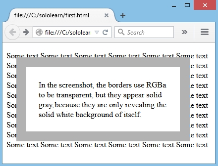
- In the example below, we set the borders to be transparent using RGBA, but they actually appear solid gray.
- 아래 예제에서는 RGBA를 사용해서 테두리를 투명하게 설정했지만, 실제로는 단색의 회색으로 표시된다.
- CSS:
border: 20px solid rgba(0, 0, 0, 0.3);
- Result:
- By setting the
background-clipproperty topadding-box, the borders will be made transparent.background-clip속성을padding-box로 설정하면 테두리가 투명해진다.
- CSS:
border: 20px solid rgba(0, 0, 0, 0.3);
-moz- background-clip: padding-box;
background-clip: padding-box;
- Result:
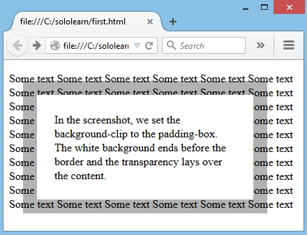
Transparency effect is achieved with the
background-clip:padding-box.투명 효과는
background-clip:padding-box로 얻을 수 있다.
Without it, the background of the box also goes beneath the borders, making it non-transparent.
이것 없이는 box의 배경이 테두리 아래로 이동해서, 투명하지 않게 된다.
QUIZ
- Drag and drop from the options below to create transparent borders for an element.
- element에 대해 투명 테두리를 생성해라.
.test {
   background-clip: padding-box;
   border: 20px solid rgba(0, 0, 0, 0.3);
}