(Gradients & Backgrounds 02) Radial(방사형) Gradients
in CSS
SoloLearn CSS 번역
CSS Radial Gradients
방사형 gradient
- To create a radial gradient, you must define at least
two color stops.- radial(방사형) gradient를 생성하기 위해 최소한
두 가지 색상 정지점을 정의해야 한다.
- radial(방사형) gradient를 생성하기 위해 최소한
- The radial gradient is defined by its
center.- radial gradient는
center에서 정의된다.
- radial gradient는
- The CSS syntax of the radial gradient looks like this:
- radial gradient의 CSS 구문은 다음과 같다.
background: radial-gradient(position, shape or size, color-stops);
- The
first valuedefines the gradient position.첫 번째 값은 gradient 위치를 정의한다.
- We can use a descriptive keyword, such as top, bottom, center, or left; or we can specify, for example, 50% 50% to set the gradient at the center or 0% 0% to set the gradient to start at top left.
- top, bottom, center, left와 같은 설명 키워드를 사용할 수 있다.
- 예를 들어, center에서 gradient를 설정하기 위해 50% 50%를 지정할 수 있다.
- 왼쪽 상단에서 gradient를 시작하도록 0% 0%를 지정할 수 있다.
- The
second valuedefines the shape and the gradient size.두 번째 값은 shape과 gradient 크기를 정의한다.
- There are two arguments to shape gradients: The first is the
ellipse,which is the default; and the second is thecircle.- gradient를 형성하는 데에는 두 가지 인수가 있다.
- 첫 번째는
ellipse이며,기본값이다. - 두 번째는
circle이다.
Lastly, the
third valuedefines the color combination.마지막으로,
세 번째 값은 색상 조합을 정의한다.
Setting the Shapes
shape 설정하기
- The shape parameter defines the shape.
- shape 매개변수는 모양을 정의한다.
- If you do not define the shape of the radial gradient, it will take the ellipse value by default.
- radial gradient의 모양을 정의하지 않으면, 기본적으로 타원 값을 사용한다.
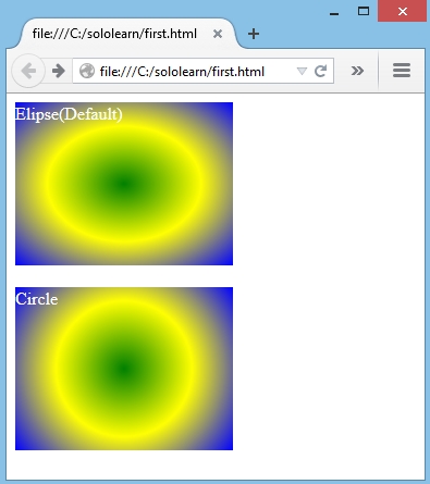
- In the example below, we didn’t specify the shape of the first div’s radial gradient, but for the second, we set the value to circle.
- 아래 예제에서 첫 번째 div의 radial gradient 모양을 지정하지 않았지만, 두 번째 경우에는 값을 circle로 설정했다.
- CSS:
div.first {
   height: 150px;
   width: 200px;
   color: #FFF;
   background: -moz- radial-gradient(green, yellow, blue);
}

div.second {
   height: 150px;
   width: 200px;
   color: #FFF;
   background: -moz- radial-gradient(circle, green, yellow, blue);
}
- Result:
Radial Gradient Position
radial gradient 위치
- Essentially, we can use the same method used to specify the location of a background image with the background-position CSS property to specify the location of the ellipse’s center.
- 기본적으로, 배경 이미지의 위치를 지정하는 데 사용되는 background-position CSS 속성을 사용해서 ellipse(타원) center의 위치를 지정할 수 있다.
- We specify the horizontal position of the background, and - optionally - the vertical position using either keywords (left, center right, or top, center, bottom), length values, percentage values, or some combination of these.
- 배경의 수평 위치를 지정한다.
- 키워드(left, center right, 또는 top, center, bottom), length 값, 백분율 값, 또는 이들 조합을 사용해서 수직 위치를 지정한다.
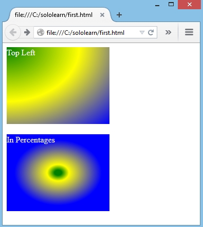
- In the example below, the first gradient starts from the top left corner; in the second, we set 5% to the green, 15% to the yellow and 60% to the blue.
- 아래 예제에서, 첫 번째 gradient는 왼쪽 상단 모서리부터 시작한다.
- 두 번째 gradient는 초록색으로 5%, 노란색으로 15%, 파란색으로 60%를 설정한다.
div.first {
   height: 150px;
   width: 200px;
   color: #FFF;
   background: -moz- radial-gradient(top left, green, yellow, blue);
}

div.second {
   height: 150px;
   width: 200px;
   color: #FFF;
   background: -moz- radial-gradient(green 5%, yellow 15%, blue 60%);
}
- Result:
In addition to percentages, you can use
pixelsorems.백분율 이외에도,
pixels또는ems를 사용할 수 있다.
Setting the Color Stops
색상 정지점 설정하기
- As with linear gradients, a color stop is specified with a color, plus an optional stop position, which is a length or percentage value.
- linear gradient의 경우와 마찬가지로, 색상 정지점은 색상과, length 또는 백분율 값인 선택적 색상 정지 위치를 사용해서 지정된다.
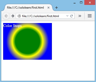
- Here’s simple circular gradient with color stops:
- 다음은 색상 정지가 있는 간단한 원형 gradient이다.
background: -moz- radial-gradient(circle, green 40%, yellow 50%, blue 70%);
- Result:
QUIZ
- Select the correct parameters for radial gradient.
- radial gradient에 대한 올바른 매개변수를 선택해라.
[ ]
Color-stops[ ] Direction
[ ]
Size[ ]
Position
- What is the default value for the “shape” parameter?
- “shape” 매개변수의 기본값은 무엇인가?
Ellipse
- Which choice is not an acceptable value for “position” parameter?
- 어떤 선택이 “position” 매개변수에 대해 받아들일 수 있는 가치가 아닌가?
[ ] Pixel
[ ]
Radian[ ] Percentage
- Add a circular radial gradient to produce black and red colors, with color-stops accordingly at 20 pixels and 70 pixels.
- 20 픽셀과 70 픽셀에서 색상 정지가 발생하도록 원형 radial gradient를 추가해서 검정색과 빨간색을 생성해라.
background: radial-gradient(circle, black 20px, red 70px);