(Gradients & Backgrounds 01) Linear(선형) Gradients
in CSS
SoloLearn CSS 번역
CSS Creating Linear Gradients
선형 gradient 생성하기
- CSS3 gradients enable you to display smooth transitions between two or more specified colors.
- CSS3 gradient를 사용하면 둘 이상의 지정된 색상 간 부드러운 전환을 표시할 수 있다.
- CSS3 defines two types of gradients:
LinearandRadial.- CSS3는
linear(선형)와radial(방사형)이라는 두 가지 type의 gradient를 정의한다.
- CSS3는
- To create a linear gradient, you must define at least two color stops.
- linear gradient를 생성하기 위해, 최소한 두 개의 색상 정지점을 정의해야 한다.
- Color stops are the colors among which you want to render smooth transitions.
- 색상 정지점은 부드러운 전환을 렌더링 하려는 색상이다.
- You can also set a starting point and a direction - or an angle - along with the gradient effect.
- gradient 효과와 함께 시작점과 방향(또는 각도)을 설정할 수도 있다.
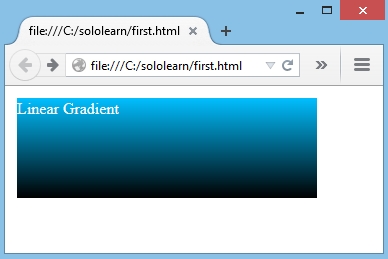
- In the example below, the colors blue and black are used to create a linear gradient from top to bottom.
- 아래 예제에서 파란색과 검정색은 위에서 아래로 linear gradient를 생성하는 데 사용된다.
div {
   float: left;
   width: 300px;
   height: 100px;
   margin: 4px;
   color: #FFF;
   background: -moz- linear-gradient(DeepSkyBlue, Black);
}
- This syntax works in Mozilla (-moz).
- 이 구문은 Mozilla(-moz)에서 작동한다.
- If you work with a different browser, add the corresponding prefix, so that the browser understands the gradient.
- 다른 브라우저로 작업하는 경우, 해당 접두사를 추가하면, 브라우저가 gradient를 인식한다.
- Result:
You can use
color names, Hex values, RGB, orHSLcolors to define the gradient color.
색상 이름, 16진수 값, RGB또는HSL색상을 사용해서 gradient 색상을 정의할 수 있다.
Color Stops
색상 정지점
- Colors can be added one after the other, separated with a comma.
- 쉼표로 구분된 색상을 차례로 추가할 수 있다.
- The browser will then determine each color stop position.
- 그러면 브라우저는 각 색상의 정지 위치를 결정한다.
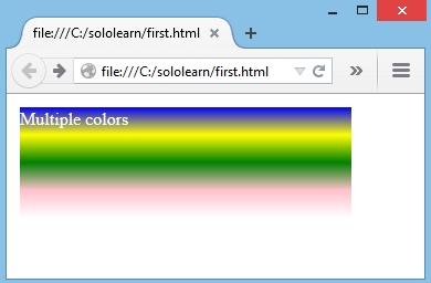
- In the example below, the linear gradient has multiple color stops and runs from top to bottom.
- 아래 예제에서 linear gradient는 여러 색상 정지점을 가지며, 위에서 아래로 실행된다.
background: -moz- linear-gradient(blue, yellow, green, pink, white);
- Result:
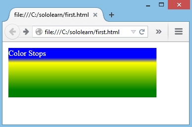
- Color stop positions can be specified for each color.
- 색상 정지 위치는 각 색상에 대해 지정할 수 있다.
background: -moz- linear-gradient(blue 20%, yellow 30%, green 85%);
- Result:
In addition to percentages, you can also use
px,em, and so on, to specify the color stops.백분율뿐만 아니라,
px,em등을 사용해서 색상 정지를 사용할 수도 있다.
If you use the same color stop position for two colors, a sharp line will be created between them.
두 가지 색상에 대해 동일한 색상 정지 위치를 사용하면, 두 색상 사이에 선이 선명하게 생성된다.
Direction of the Gradient
gradient의 방향
- The direction of the gradient can be changed.
- gradient의 방향을 변경할 수 있다.
- In the example below, the first gradient starts at
left, movingright; the second one runs frombottomtotop.- 아래 예제에서 첫 번째 gradient는
left에서 시작해서right로 이동한다. - 두 번째 gradient는
bottom에서top으로 실행된다.
- 아래 예제에서 첫 번째 gradient는
div.first {
   float: left;
   width: 300px;
   height: 100px;
   margin: 4px;
   color: #FFF;
   background: -moz- linear-gradient(left, blue, green, white);
}

div.second {
   float: left;
   width: 300px;
   height: 100px;
   margin: 4px;
   background: -moz- linear-gradient(bottom, blue, green, white);
}
- Result:
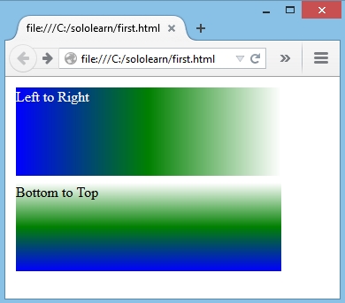
left,right,top, andbottomare supported values for the gradient direction.
left,right,top,bottom은 gradient 방향에 대해 지원되는 값이다.
You can also use their various combinations to specify direction (e.g.,
bottom right)다양한 조합을 사용해서 방향(예:
bottom right)을 지정할 수도 있다.
Angle of the Gradient
gradient의 각도
- As an alternative to predefined directions (bottom, top, right, left, bottom right, etc.), you can control the gradient’s direction by specifying an angle.
- 사전 정의된 방향(bottom, top, right, left, bottom right 등) 대신에 각도를 지정해서 gradient의 방향을 제어할 수 있다.
- The angle is specified as an angle extending between a horizontal line and the gradient line.
- 각도는 가로선과 gradient 선 사이의 각도로 지정된다.
- In other words, 0deg creates a left-to right-gradient, while 90deg generates a bottom-to-top gradient.
- 즉, 0도는 왼쪽에서 오른쪽으로 gradient를 생성하고, 90도는 아래쪽에서 위쪽으로 gradient를 생성한다.
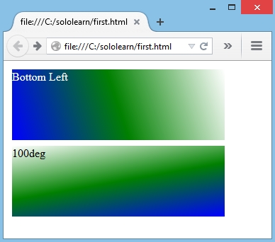
div.first {
   float: left;
   width: 300px;
   height: 100px;
   margin: 4px;
   color: #FFF;
   background: -moz- linear-gradient(bottom left, blue, green, white);
}

div.second {
   float: left;
   width: 300px;
   height: 100px;
   margin: 4px;
   background: -moz- linear-gradient(100deg, blue, green, white);
}
- Result:
Repeating a Linear-Gradient
linear-gradient 반복
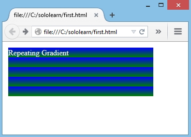
- The
repeating-linear-gradient()function is used to repeat a linear gradient.repeating-linear-gradient()함수는 linear gradient를 반복하는 데 사용된다.
background: -moz- repeating-linear-gradient(blue, green, 20px);
- Result:
QUIZ
- What types of color values can NOT be used within the linear gradient property?
- linear gradient 속성에서 사용할 수 없는 색상 값 type은 무엇인가?
[ ] Hexadeciaml
[ ] HSL
[ ]
CMYK[ ] RGB
- Add the missing color stop value to create sharp lines between the colors.
- 누락된 색상 정지 값을 추가해서, 색상 사이에 선을 선명하게 생성해라.
background: linear-gradient(red 20%, green 20%, green 80%, blue 80%);
- Which one of the following directions is not supported for the linear-gradient?
- linear-gradient에서 지원되지 않는 방향은 다음 중 어느 것인가?
[ ] Right
[ ]
Center[ ] Left
[ ] Bottom
- Which one of the following choices is equivalent to the example below?
- 아래 예제와 동일한 것은 무엇인가?
linear-gradient(left, red, yellow);
linear-gradient(0deg, red, yellow);
- Which property is correct for creating a repeating gradient?
- 반복되는 gradient를 생성하는 데 올바른 속성은 무엇인가?
repeating-linear-gradient