(CSS3 Basics 07) text-shadow 속성
in CSS
SoloLearn CSS 번역
CSS text-shadow Property
text-shadow 속성
- The
text-shadowproperty defines one or more comma-shadow effects, to be applied to the text content of the current element.text-shadow속성은 쉼표로 구분된 하나 이상의 그림자 효과를 정의해서, 현재 element의 텍스트 content에 적용한다.
- The image below shows how the text-shadow property is applied:
- 아래 이미지는 text-shadow 속성이 적용된 방법을 보여준다.
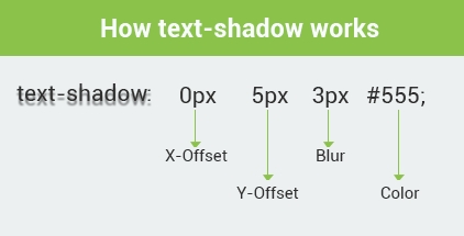
The
offset-xandoffset-yvalues are required for the CSS text-shadow property.
offset-x와offset-y값은 CSS text-shadow 속성에 필요하다.
The
colorvalue is not required, but since the default for the text-shadow is transparent, the text-shadow will not appear unless you specify a color value.
color값은 필요하지 않지만, text-shadow의 기본값은 투명하므로, 색상 값을 지정하지 않으면 text-shadow가 표시되지 않는다.
Multiple Text Shadows
여러 텍스트 그림자
- The text-shadow style can accept multiple values in a comma-separated list.
- text-shadow style은 여러 값을 쉼표로 구분된 list로 허용할 수 있다.
- According to CSS2, the shadows are laid down in the order they appear, so if they overlap, the last one that is specified should appear on top.
- CSS2에 따르면, 그림자는 나타나는 순서대로 놓여 있기 때문에, 마지막에 지정된 그림자가 맨 위에 표시되어야 한다.
- CSS3 has now changed that so they are applied in
reverse order.- 이제 CSS3가 변경되어
역순으로 적용된다.
- 이제 CSS3가 변경되어
- To create multiple shadows, the shadows are separated with a comma.
- 여러 개의 그림자를 생성하기 위해, 그림자를 쉼표로 구분한다.
h1 {
   text-shadow: 5px 10px 2px #93968f,
      -3px 6px 5px #58d1e3;
}
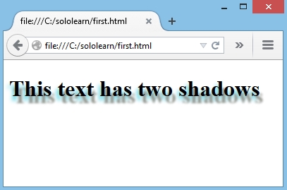
- This example defines two text shadows at different locations, blur radius, and colors.
- 이 예제는 서로 다른 위치에 있는 두 개의 텍스트 그림자를 정의한다.
- (blur 반경, 색상)
- This makes it look like there are two different light sources on the text.
- 이렇게 하면 텍스트에 두 개의 다른 광원이 있는 것처럼 보인다.
- To make a text shadow look realistic, remember these few shadow characteristics:
- 텍스트 그림자를 사실적으로 보이게 하려면, 다음과 같은 shadow 특성을 기억해라.
- A shadow which is close to the text is normally not as blurred as a shadow that is far from the text.
- 텍스트에 가까운 그림자는 일반적으로 텍스트에서 멀리 떨어진 그림자처럼 흐려지지 않는다.
- A shadow that is far from the text usually implies a light source which is also far from the text.
- 텍스트에서 멀리 떨어져 있는 그림자는 일반적으로 텍스트와 멀리 떨어져 있는 광원을 의미한다.
- A shadow which is close to the text usually implies that the underlying surface is close, that the light is close, or both.
- 텍스트에 가까운 그림자는 일반적으로 아래에 있는 표면이 가깝거나, 빛이 가깝거나, 둘 모두를 의미한다.
- A close shadow is often darker than a distant shadow, because less light can get in between the shape and the underlying surface.
- 가까운 그림자는 먼 그림자보다 어두운 경우가 많으므로, 모양과 아래 표면 사이에 빛이 들어가지 않을 수 있다.
To remove a text-shadow, set the text-shadow property to
none;no shadows will be associated with that element.text-shadow를 제거하기 위해, text-shadow 속성을
none;으로 설정해라.그림자는 해당 element와 관련이 없게 된다.
QUIZ
- Add a 25-pixel left and 15-pixel down blue text-shadow.
- 왼쪽 25 픽셀, 아래로 15 픽셀 파란색 text-shadow를 추가해라.
p {
   text-shadow: -25px 15px blue;
}
- How many text-shadow properties can an element accept?
- element가 허용할 수 있는 text-shadow 속성은 몇 개인가?
Multiple