(CSS3 Basics 06) 투명 효과
in CSS
SoloLearn CSS 번역
CSS Transparency Effect
투명 효과
- Before CSS3, transparent background images were used to create transparency effects.
- CSS3 이전에는 투명한 배경 이미지를 사용해서 투명 효과를 생성했다.
- The new features of CSS3 now make it easier to create transparency effects.
- 이제 CSS3의 새로운 기능으로 투명 효과를 보다 쉽게 생성할 수 있다.
- CSS supports color names, hexadecimal, and RGB colors.
- CSS는 색상 이름, 16진수, RGB 색상을 지원한다.
- In addition, CSS3 introduces the following:
- 게다가 CSS3에서는 다음과 같은 기능을 제공한다.
RGBA Colors
RGBA 색상
- RGBA color values are an extension of RGB color values with an alpha channel, which specifies the opacity for a color.
- RGBA 색상 값은 색상의 불투명도를 지정하는 alpha channel이 있는 RGB 색상 값의 확장이다.
- An RGBA color value is specified with:
rgba(red, green, blue, alpha).- RGBA 색상 값은
rgba(red, green, blue, alpha)로 지정된다.
- RGBA 색상 값은
- The alpha parameter is a number between 0.0 (fully transparent) and 1.0 (fully opaque).
- alpha 매개변수는 0.0(완전 투명)과 1.0(완전 불투명) 사이의 숫자이다.
HSL Colors
HSL(Hue, Saturation, Lightness) 색상
- An HSL color value is specified with:
hsl(hue, saturation, lightness).- HSL 색상 값은
hsl(hue, saturation, lightness)로 지정된다.
- HSL 색상 값은
- Hue is a degree on the color wheel ranging from 0 to 360.
- 색조(Hue)는 0에서 360 사이의 색상 범위를 나타낸다.
- 0 (or 360) is red, 120 is green, 240 is blue.
- 0(또는 360)은 빨간색, 120은 초록색, 240은 파란색이다.
- Saturation is a percentage value: 100% is the full color.
- 채도(Saturation)는 백분율 값이다.
- 100%는 full color(천연색)이다.
- Lightness is also a percentage; 0% is dark (black) and 100% is white.
- 밝기(Lightness)도 백분율이다.
- 0%는 어둡고(검은색), 100%는 흰색이다.
HSLAcolor values are an extension of HSL color values with an alpha channel - which specifies the opacity for a color (just like RGBA).HSLA색상 값은 alpha channel이 있는 HSL 색상 값의 확장이다.- (RGBA와 마찬가지로) 색상의 불투명도를 지정한다.
- In the example below, a transparent glass menu bar is created with CSS3.
- 아래 예제에서는, CSS3를 사용해서 투명한 유리 메뉴바가 생성된다.
- In the HTML file, a <nav> tag containing an <ul> list with links has been added:
- HTML 파일에서, 링크가 있는 <ul> list를 포함하는 <nav> 태그가 추가되었다.
<nav>
   <ul>
      <li><a href="#">COURSES</a></li>
      <li><a href="#">DISCUSS</a></li>
      <li><a href="#">TOP LEARNERS</a></li>
      <li><a href="#">BLOG</a></li>
   </ul>
</nav>
- A number of CSS3 features are used to create the effects:
- CSS3 기능의 숫자는 효과를 생성하기 위해 사용된다.
body {
   background: url("bg.jpg");
}

nav {
   padding: 50px 0;
   min-width: 500px;
}

nav ul {
   background: linear-gradient(90deg,
   rgba(255, 255, 255, 0) 0%,
   rgba(255, 255, 255, 0.2) 25%,
   rgba(255, 255, 255, 0.2) 75%,
   rgba(255, 255, 255, 0), 100%);
   box-shadow: 0 0 25px rgba(0, 0, 0, 0.1),
      inset 0 0 1px rgba(255, 255, 255, 0.6);
}

nav ul li {
   display: inline-block;
}

nav ul li a {
   padding: 10px;
   color: #FFFFFF;
   font-size: 18px;
   font-family: Arial;
   text-decoration: none;
   display: block;
}
- Result:
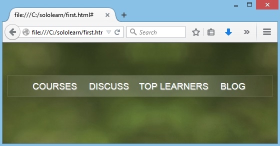
- The <ul> tag has been styled with a background gradient that is white and transparent.
- <ul> 태그는 흰색과 투명 배경 gradient로 style이 지정되었다.
- Two box-shadow values have been added, one for an outer, dark shadow; and one for an inner, light edge.
- 두 개의 box-shadow 값이 추가되었다.
- 하나는 바깥쪽의 어두운 그림자이다.
- 하나는 안쪽의 밝은 가장자리이다.
QUIZ
- Fill in the blanks to create a footer with an inset box-shadow and a 1 pixel border at the top.
- inset box-shadow와 상단의 1 픽셀 테두리가 있는 footer를 생성해라.
#footer {
   border-top: 1px solid rgba(0, 0, 0, 0.3);
   background: rgba(0, 0, 0, 0.25);
   box-shadow: inset 0 1px;
   rgba(255, 255, 255, 0.3);
   height: 40px;
}