(CSS3 Basics 03) 둥근 모서리
in CSS
SoloLearn CSS 번역
CSS Rounded Corners
둥근 모서리
The border-radius Property
border-radius 속성
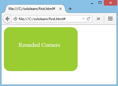
- With CSS3, you can give any element “rounded corners” by using the
border-radiusproperty.- CSS3와 함께
border-radius속성을 사용해서 “둥근 모서리” element를 지정할 수 있다.
- CSS3와 함께
- CSS:
border-radius: 20px;
background-color: green;
color: white;
- Result:
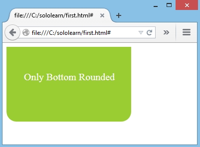
- Specific border radius values can be applied for the border-radius property in the following order:
top-left,top-right,bottom-right,bottom-left.- 특정 테두리 반경 값은 다음 순서대로 border-radius 속성에 적용할 수 있다.
top-left,top-right,bottom-right,bottom-left
border-radius: 0 0 20px 20px;
- Result:
The value of border-radius can also be specified in
percentages.border-radius 값은
백분율로 지정할 수도 있다.
Creating a Circle
원 만들기
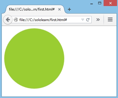
- A rectangle can be turned into a circle using only CSS.
- CSS만 사용해서 직사각형을 원으로 변경할 수 있다.
- To create a circle, the border radius should be half of the height and the width.
- 원을 만들려면, 테두리 반경이 높이와 너비의 절반이어야 한다.
- The rectangle in the example below has a width and height of 200px.
- 아래 예제의 직사각형은 너비와 높이가 200px이다.
- By setting the border radius to
100px, the corners will be rounded to form a circle:- 테두리 반경을
100px로 설정하면, 모서리가 둥근 원형이 된다.
- 테두리 반경을
div {
   width: 200px;
   height: 200px;
   border-radius: 100px;
   background-color: green;
   color: white;
}
- Result:
QUIZ
- Add the border-radius values to indicate 0 pixels to the top-left, 15pixels to the bottom-left, 10 pixels to the bottom-right, 20 pixels to the top-right:
- border-radius 값을 추가해서 top-left를 0 픽셀, bottom-left를 15 픽셀, bottom-right를 10 픽셀, top-right를 20 픽셀로 나타내라.
.test {
   border-radius: 0px 20px 10px 15px;
}
- To make a circle, the border radius should be …
- 원을 만들려면, 테두리 반경이 …해야 한다.
equal to half of the height and the width높이와 너비의 절반과 같아야 한다