(Text 11) text-shadow 속성
in CSS
SoloLearn CSS 번역
CSS text-shadow Property
text-shadow 속성
- The text-shadow property adds shadow to text.
- text-shadow 속성은 텍스트에 그림자를 추가한다.
- It takes four values: the first value defines the distance of the shadow in the
x (horizontal) direction, the second value sets the distance in they (vertical) direction, the third value defines theblurof the shadow, and the fourth value sets thecolor.- 이 속성은 네 가지 값을 취한다.
- 첫 번째 값은 그림자의
x(가로) 방향거리를 정의한다. - 두 번째 값은 그림자의
y(세로) 방향거리를 설정한다. - 세 번째 값은 그림자의
blur(흐릿한 것)를 정의한다. - 네 번째 값은 그림자의
color를 정의한다.
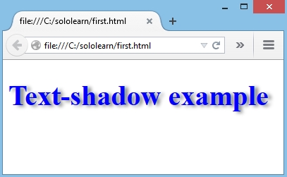
- HTML:
<h1>
   Text-shadow example
</h1>
- CSS:
h1 {
   color: blue;
   font-size: 30pt;
   text-shadow: 5px 2px 4px grey;
}
- In the example above, we created a shadow using the following parameters:
- 위의 예제에서 다음 매개변수를 사용해서 그림자를 생성했다.
5px: the X-coordinate- X 좌표
2px: the Y-coordinate- Y 좌표
4px: the blur radius- blur 반경
grey: the color of the shadow- 그림자 색상
- Result:
To add more than one shadow to the text, add a comma-separated list of shadows.
텍스트에 둘 이상의 그림자를 추가하려면, 쉼표로 구분된 그림자 list를 추가해라.
text-shadow with Blur Effect
blur 효과가 있는 text-shadow
- When working with shadows, you can use any CSS-supported color format.
- 그림자를 사용하는 경우, CSS 지원 색상 형식을 사용할 수 있다.
- For the x and y offsets, various types of units can be used (like
px,cm,mm,in,pc,pt, etc).- x와 y offset의 경우, 다양한 type의 단위를 사용할 수 있다.
- (예:
px,cm,mm,in,pc,pt등)
- Negative values are also supported.
- 음수 값도 지원된다.
- The example below creates a blue drop-shadow, two pixels higher than the main text, one pixel to the left of it, and with a 0.5em blur:
- 아래 예제에서는 메인 텍스트보다 2px 높고, 왼쪽으로 1px, 0.5em blur가 있는 파란 그림자가 생성된다.
- HTML:
<h1>Text-shadow with blur effect </h1>
- CSS:
h1 {
   font-size: 20pt;
   text-shadow: rgba(0, 0, 255, 1) -1px -2px 0.5em;
}
- Result:
Internet Explorer 9 and earlier do not support the text-shadow property.
IE9과 이전 버전에서는 text-shadow 속성을 지원하지 않는다.
QUIZ
- What is the format of the value for the text-shadow property?
- text-shadow 속성 값의 형식은 무엇인가?
horizontal position vertical position blur color
- Create a text shadow with horizontal and vertical distance of 5px and blur radius of 2px:
- 가로 및 세로 거리가 5px이고, blur 반경이 2px인 텍스트 그림자를 생성해라.
p {
   text-shadow: 5px 5px 2px;
}